On a un mantra autour du studio. Gens inspirés, travail inspiré. On croit vraiment que notre meilleur travail vient de travailler avec des clients inspirés et inspirants. C’est pour cette raison qu’on est toujours ravis d’être reconnus par nos pairs pour le travail qu’on fait avec nos clients les plus inspirés.
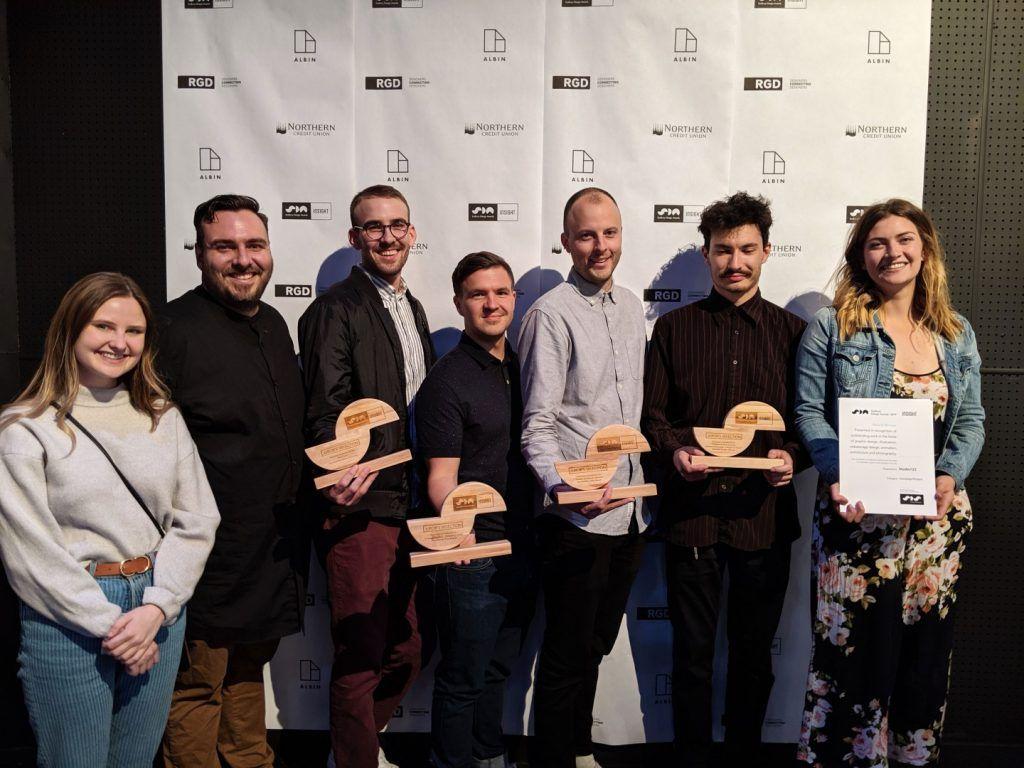
La semaine dernière, notre travail a été reconnu par un jury international de gens qui oeuvrent dans le monde du design et des communications au gala du Sudbury Design Awards. Onze projets de Studio123 ont été reconnus et quatre d’entre eux ont remporté un prix du jury.
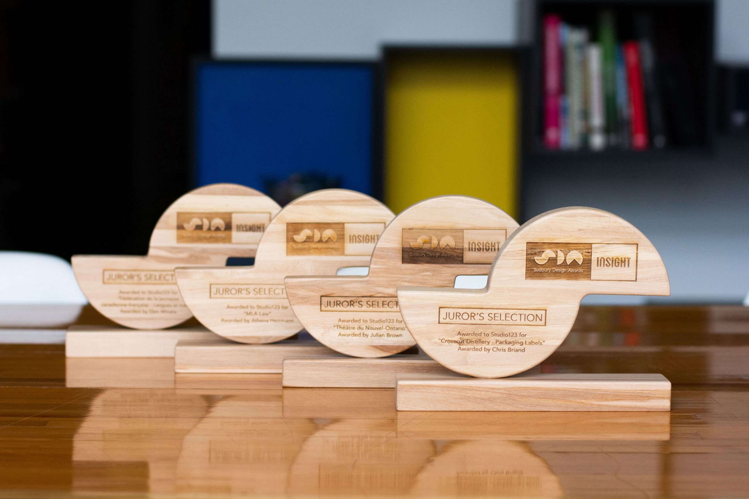
Notre travail avec Crosscut Distillery, la Fédération de la jeunesse canadienne-française, le Théâtre du Nouvel-Ontario et MLA Law ont chacun remporté un prix.
Les Sudbury Design Awards célèbrent le travail remarquable dans les domaines du graphisme, de l’illustration, de la conception de sites Web et d’applications, de l’animation, de l’architecture et de la photographie. Des agences de création locales et des pigistes ont soumis plus de 65 projets et 40 d’entre eux ont été sélectionnés par un panel international pour faire partie de l’exposition au gala. Le jury de cette année était compris d’Athena Herrmann de l’agence Akendi, Chris Briand de DAVIDsTEA, Paddy Harrington de l’agence Frontier, Julian Brown de l’agence ON THE CHASE! et l’illustratrice Elen Winata.
Sélection du juré
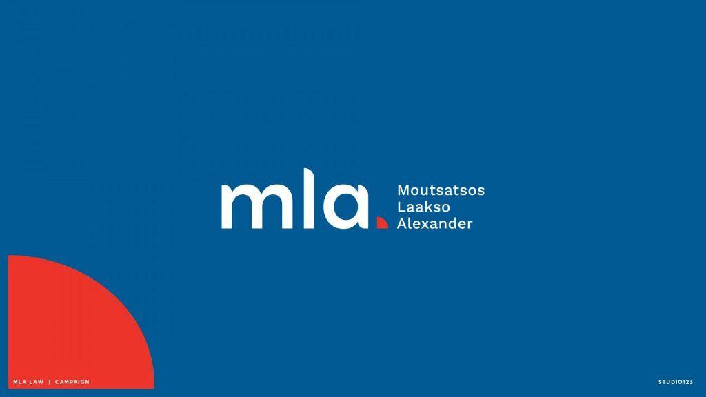
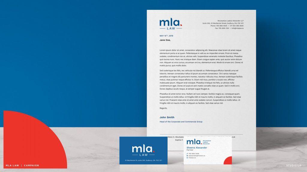
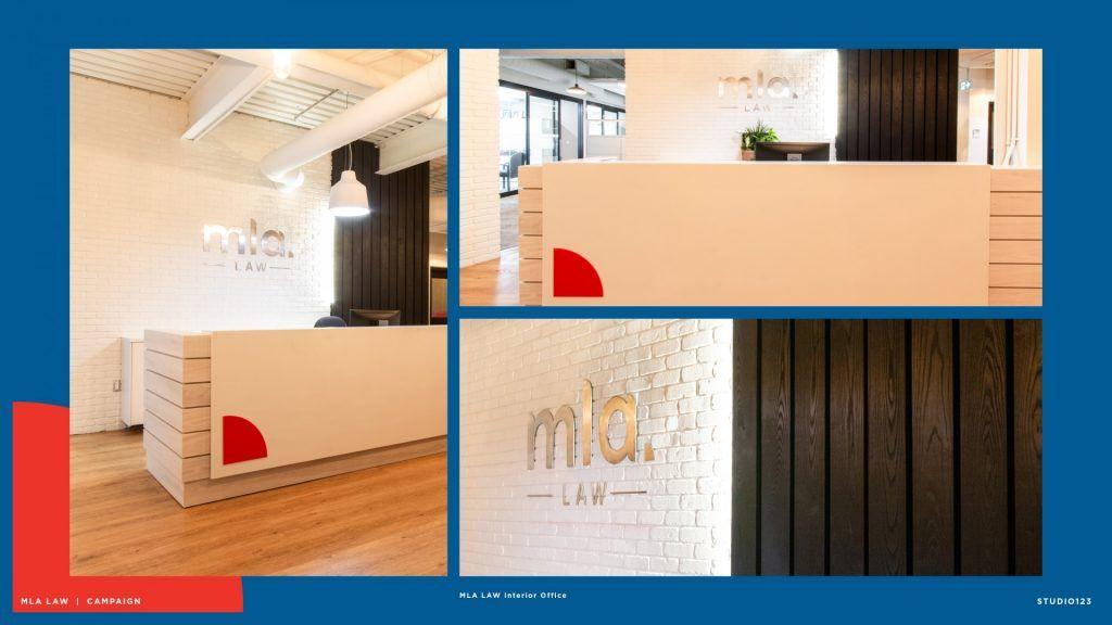
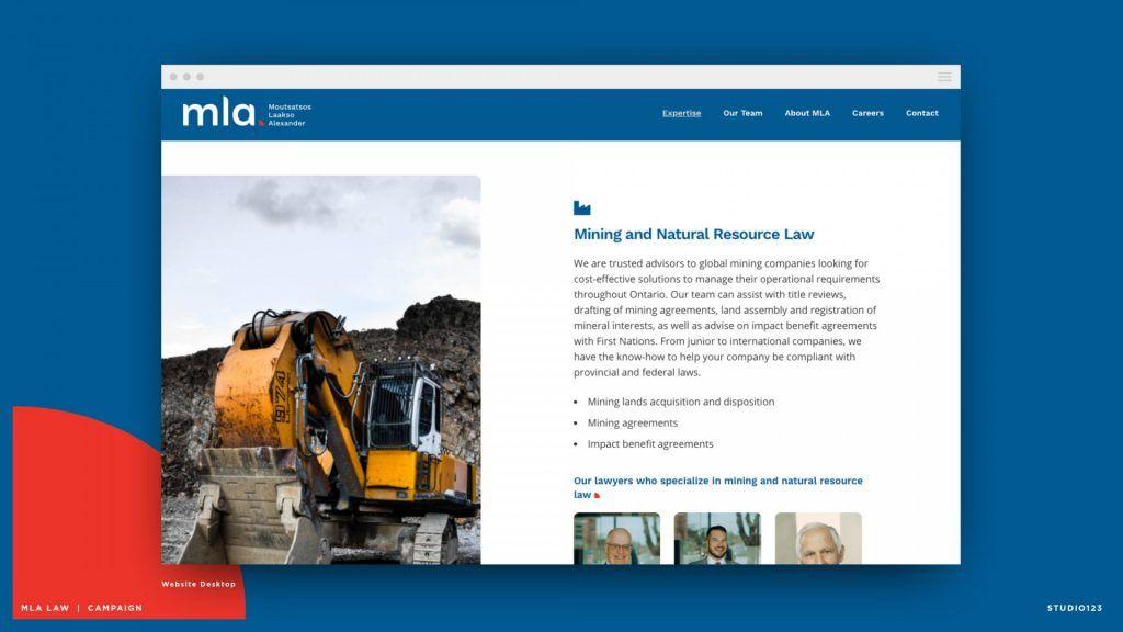
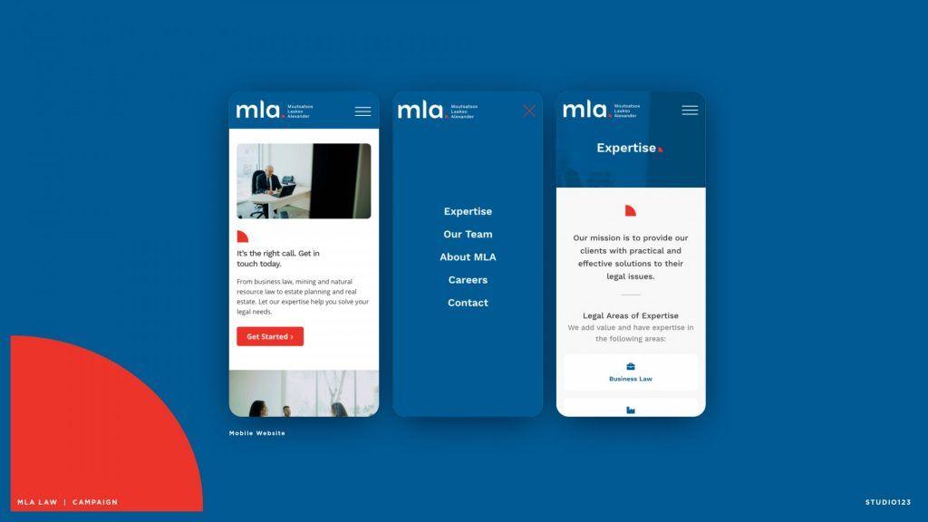
MLA Law
“The law firm branding was a fresh take on law firm branding that successfully differentiated this company from others in the market. It goes against the traditional, stuffy, conservative look with a modern, fun approach that would appeal to a new generation of people who need to seek law services. I especially like the way the logotype was customized to help better relate to the demographic it’s seeking to attract.”
- Athena Herrmann

Sélection du juré
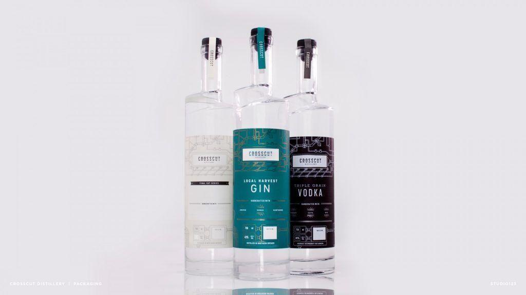
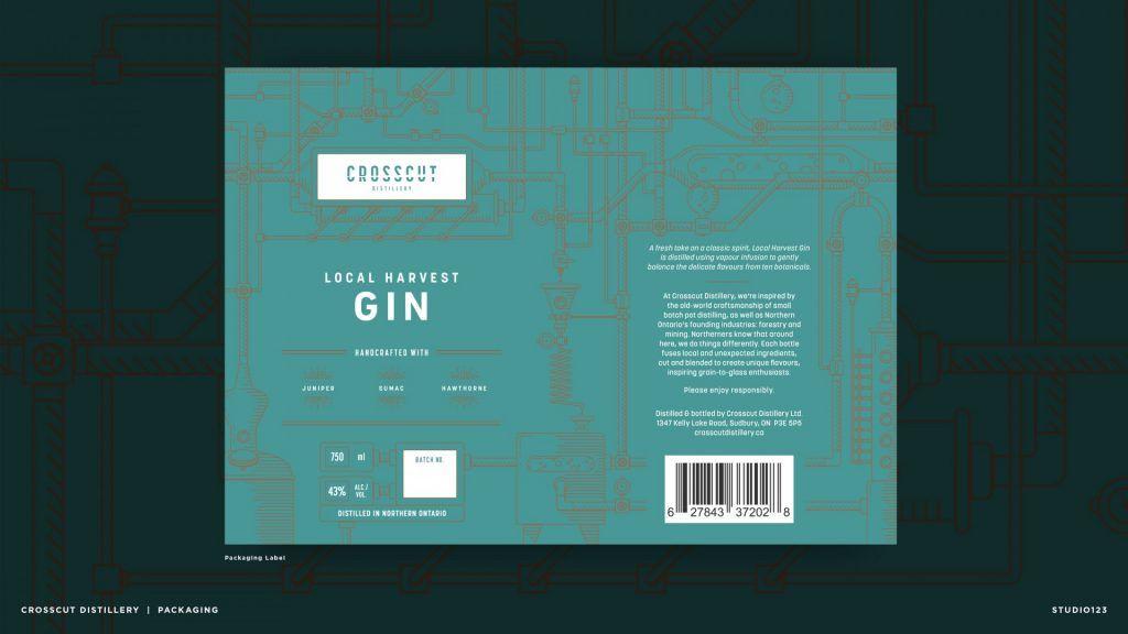
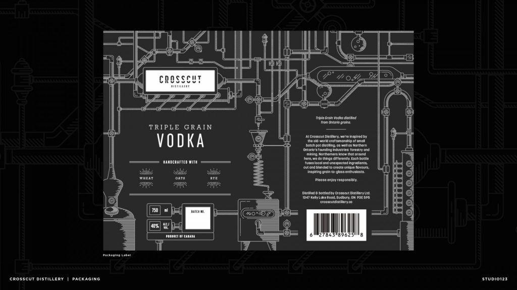
Crosscut Distillery
“Similar to the client’s product, the mix of simplicity, detailing, and colour choices are gently balanced to create an attractive yet highly functional, recognizable design. The foil adds to the strength of the label without being necessary while the template’s flexibility allows for the possibility of expanding the product line.”
- Chris Briand

Juror's Selection
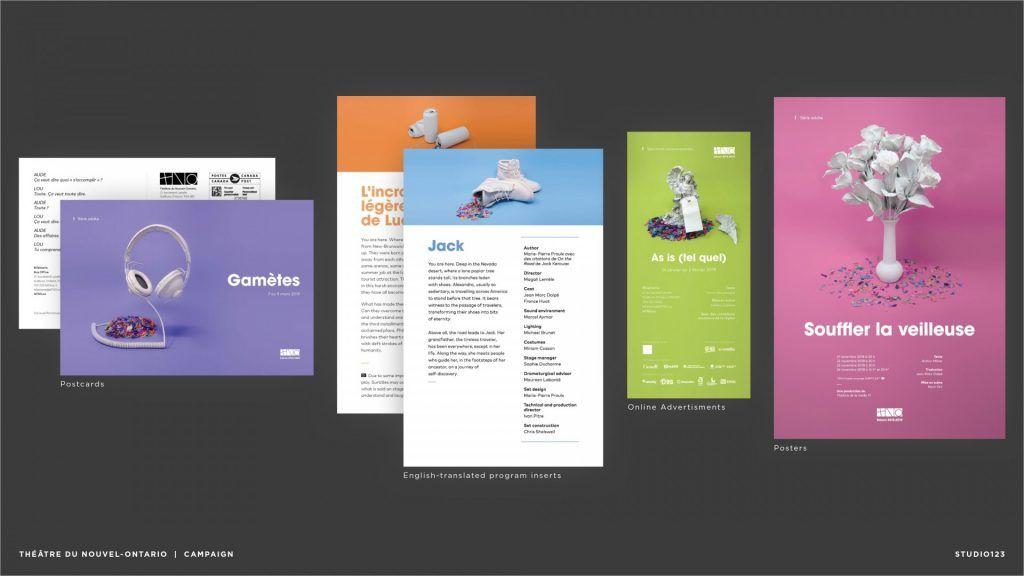
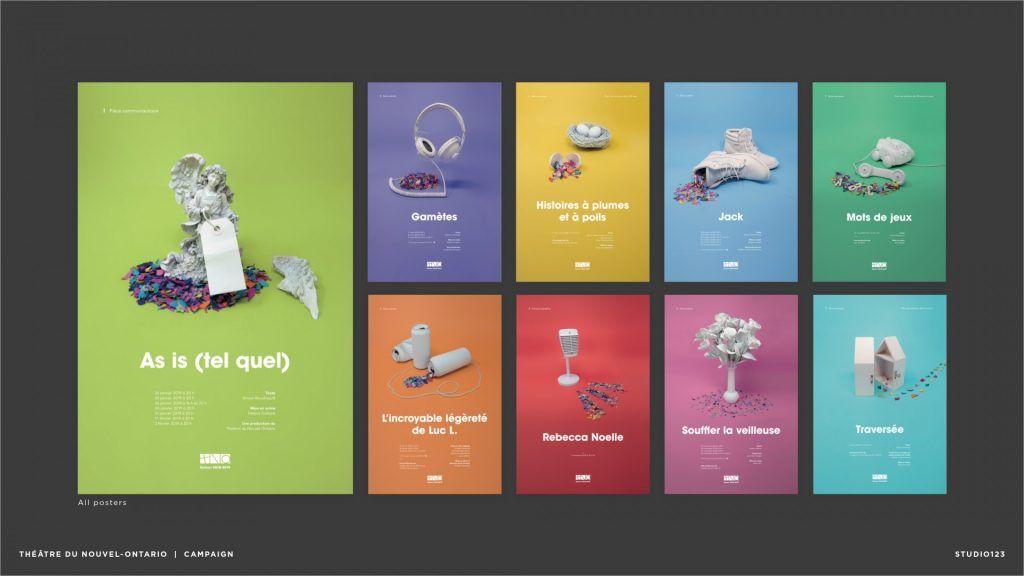
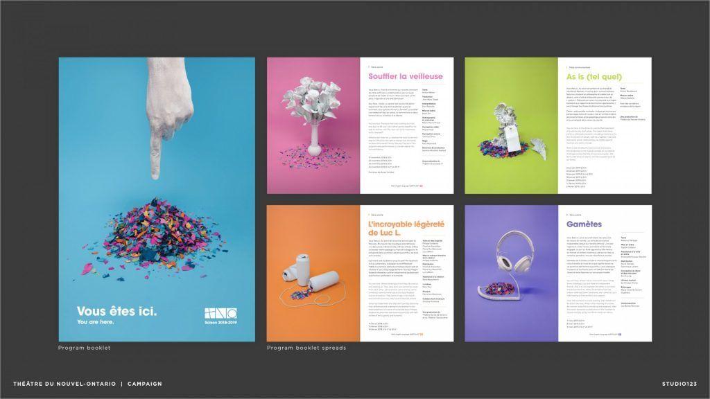
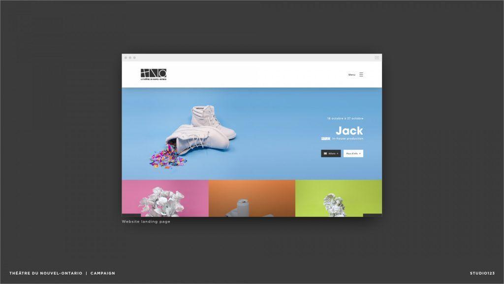
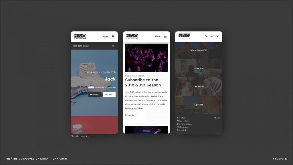
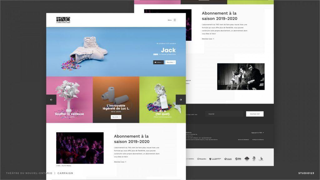
Théâtre du Nouvel-Ontario
“Bold and enigmatic, spacious and inviting, but also straightforward and functional. The photography and design elements catch your attention without overtaking the subject matter—making this an excellent overall campaign.”
- Julian Brown
Sélection du juré
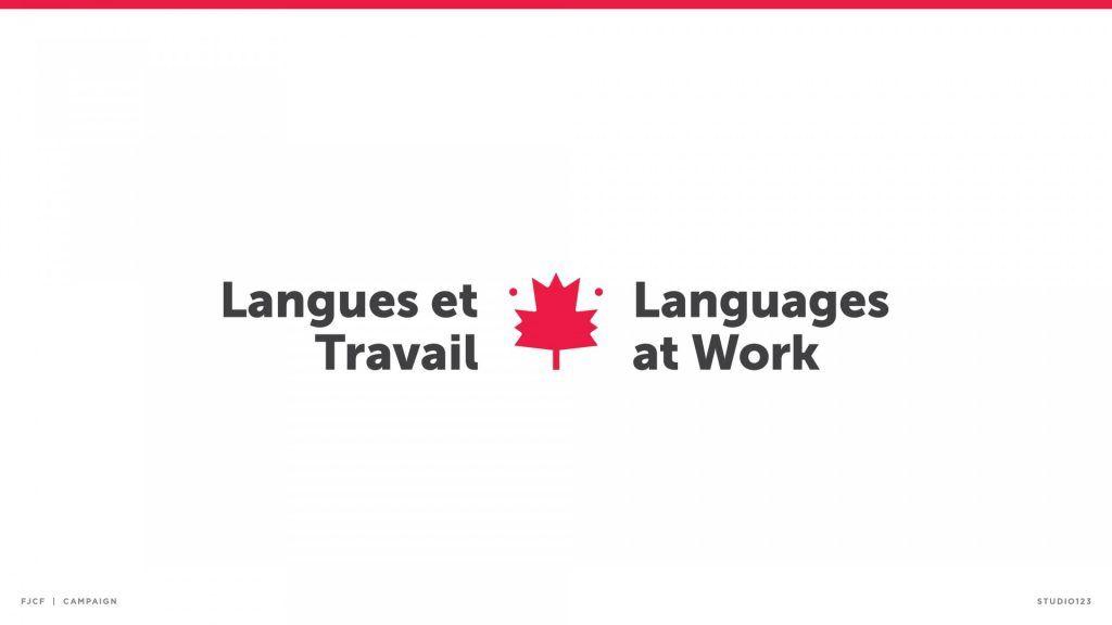
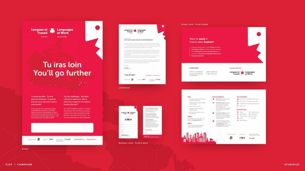
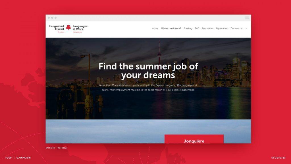
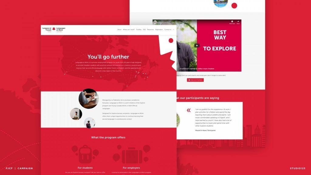
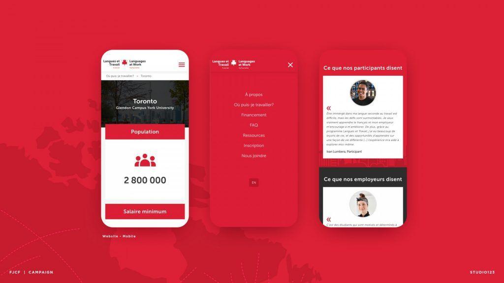
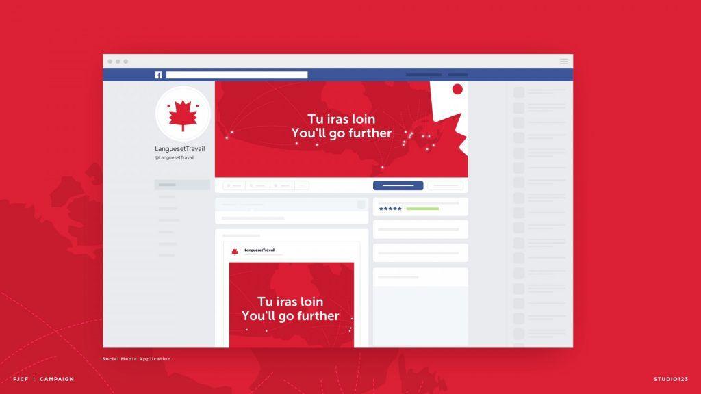
Fédération de la jeunesse canadienne-français - Langues et travail
“I think the way negative space was used in the design is really clever, as not only it conveys the brand’s mission (practicing a language), it also ties back perfectly with the brand’s Canadian roots. The logomark itself is really strong, and overall lovely execution across the different branding materials as well.”
- Elen Wintra
Toutes nos félicitations vont à nos clients qui ont été reconnus lors de cet événement. Merci de la confiance que vous nous accordez.