Cambrian College
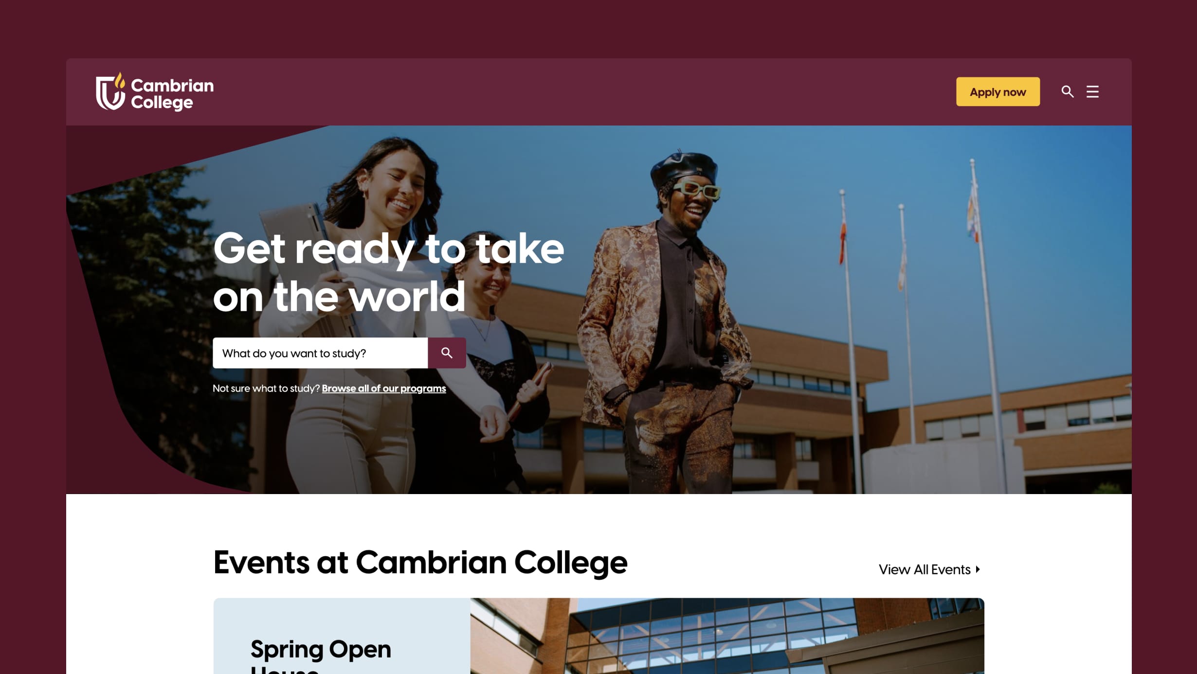
Cambrian College, a prominent educational institution in Northern Ontario, faced a challenge: its outdated website was hindering student recruitment efforts and was difficult to manage.
Aiming to enhance accessibility, streamline content management, and refresh its image, Cambrian embarked on a comprehensive rebranding and website redevelopment initiative. The old website, plagued by usability issues and a cluttered design, frustrated users—particularly prospective students—who struggled to find crucial program information. This inefficiency was underscored by a survey showing that 69% of visitors faced difficulties navigating the site. Moreover, the outdated backend system added to internal woes, necessitating a thorough overhaul to better support marketing efforts and improve overall user experience and engagement.

We approached Cambrian College's new website with clear priorities:
- Prioritize student recruitment as the website’s top objective.
- Ensure users could easily access essential information, particularly program information.
- Cater to diverse internal and external audiences, such as parents, counselors, prospective employees, partners, donors, and alumni.
- Authentically reflect Cambrian’s inviting atmosphere and let its warm and welcoming experience shine through.
- Make accessibility a fundamental consideration, ensuring equitable access for all users.
Creative Research
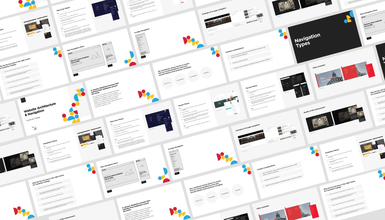
A crucial factor in the project's success was an early emphasis on creative direction. We believe anything is possible when it comes to designing and building websites. As we completely reimagined the user experience in the midst of a corporate rebrand, it was essential to conduct and present thorough creative research to define our direction. The summary of our findings and subsequent recommendations enabled alignment between Studio123 and Cambrian College project teams, ultimately streamlining the design process.
We began by reviewing and analyzing every college website in Ontario to identify common trends and determine how Cambrian could stand out. We then expanded our search to include global benchmarks for additional inspiration. This research provided valuable insights for our teams to discuss, debate, and consider before diving into the design process.
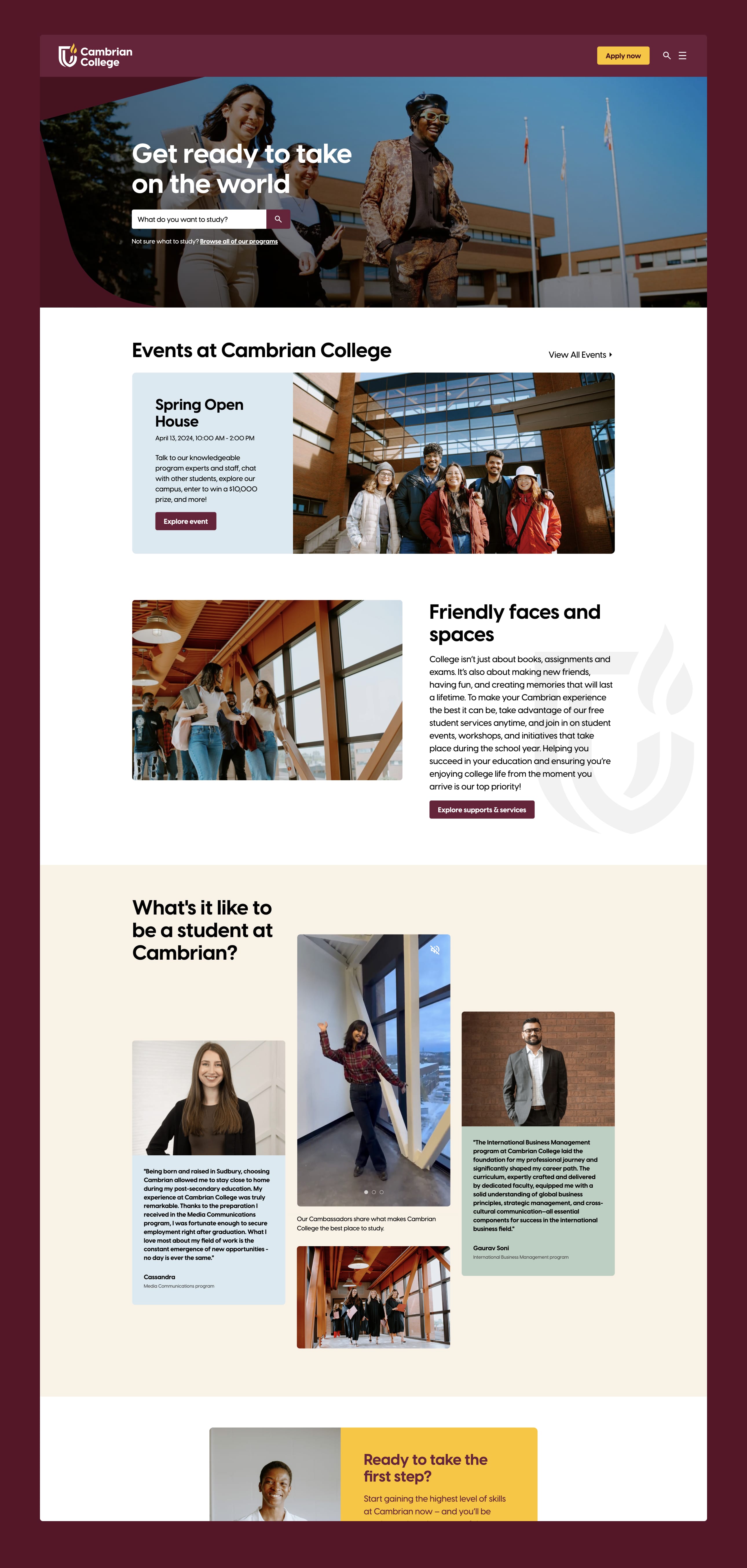
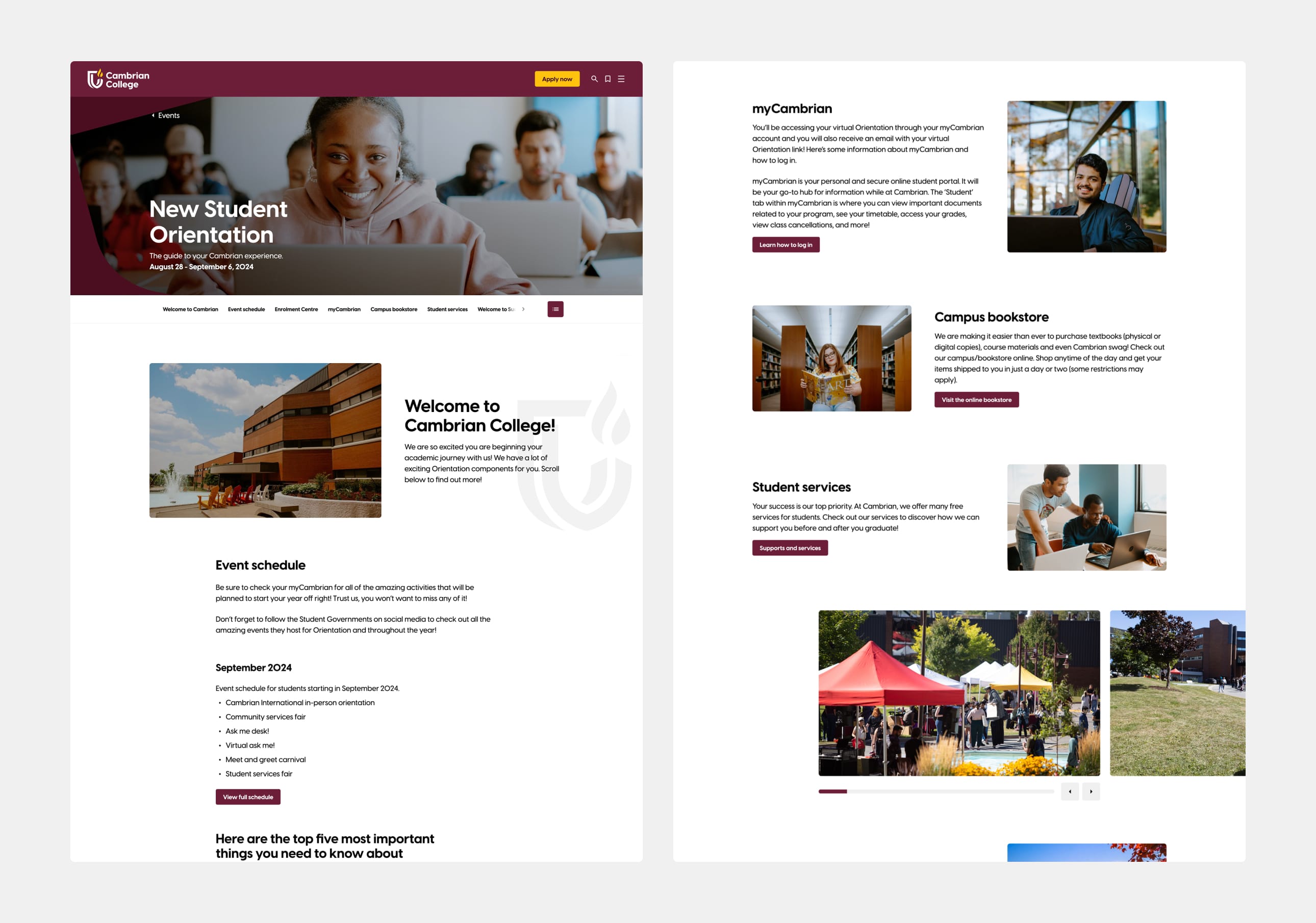
Our team employed analysis, strategic thinking, thoughtful design and skillful programming to successfully achieve the website's identified goals. Among dozens of important improvements, here are a few features and upgrades that we were particularly pleased to implement:
Responsive parity
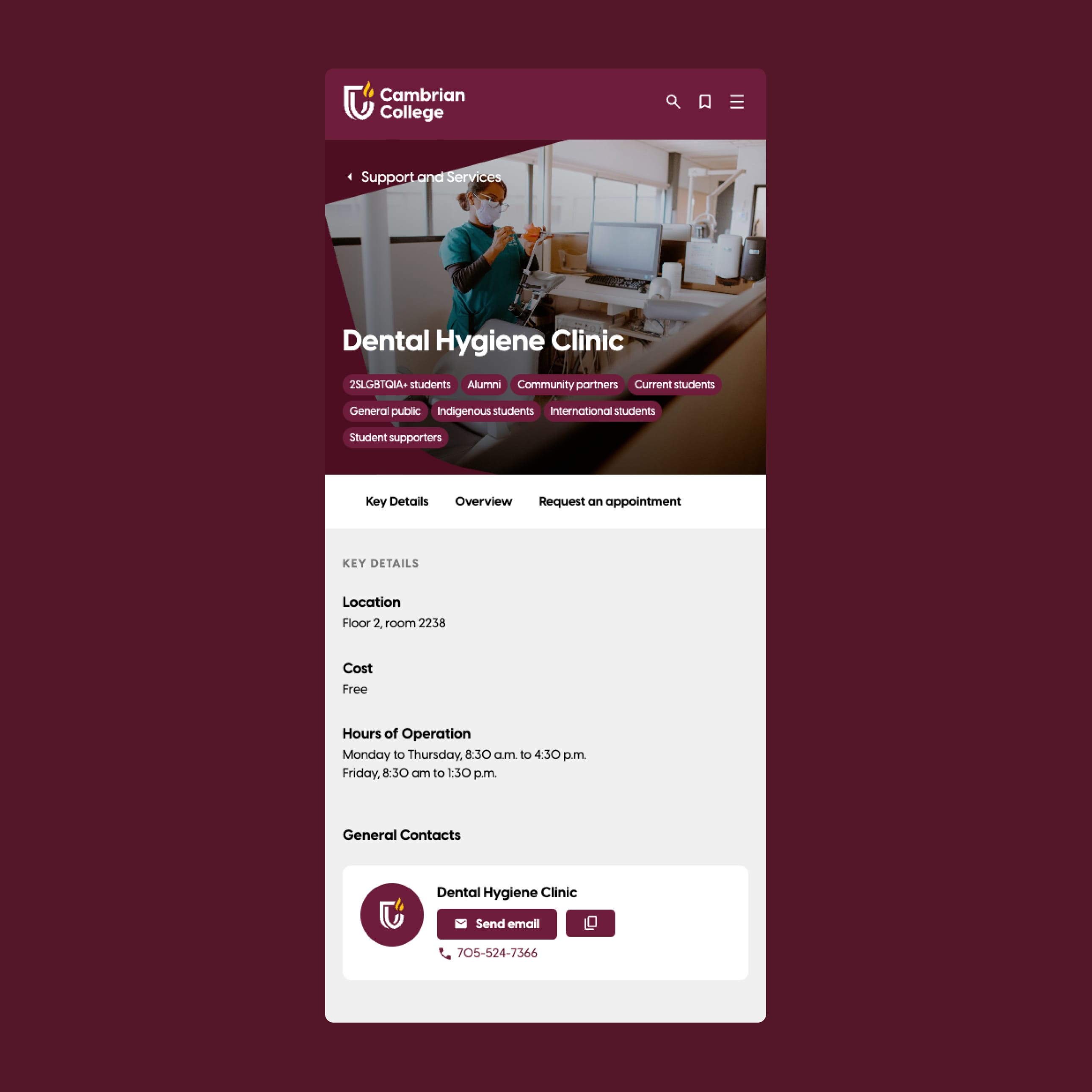
We prioritized creating intuitive user experiences that perform optimally on both mobile and desktop devices. As users become familiar with a website, they internalize its UX patterns and navigation. We designed these patterns to remain consistent across different devices to add delight and simplify the user experience. Ensuring a seamless and consistent experience across both mobile and desktop platforms was important to us.
A step-by-step navigation system
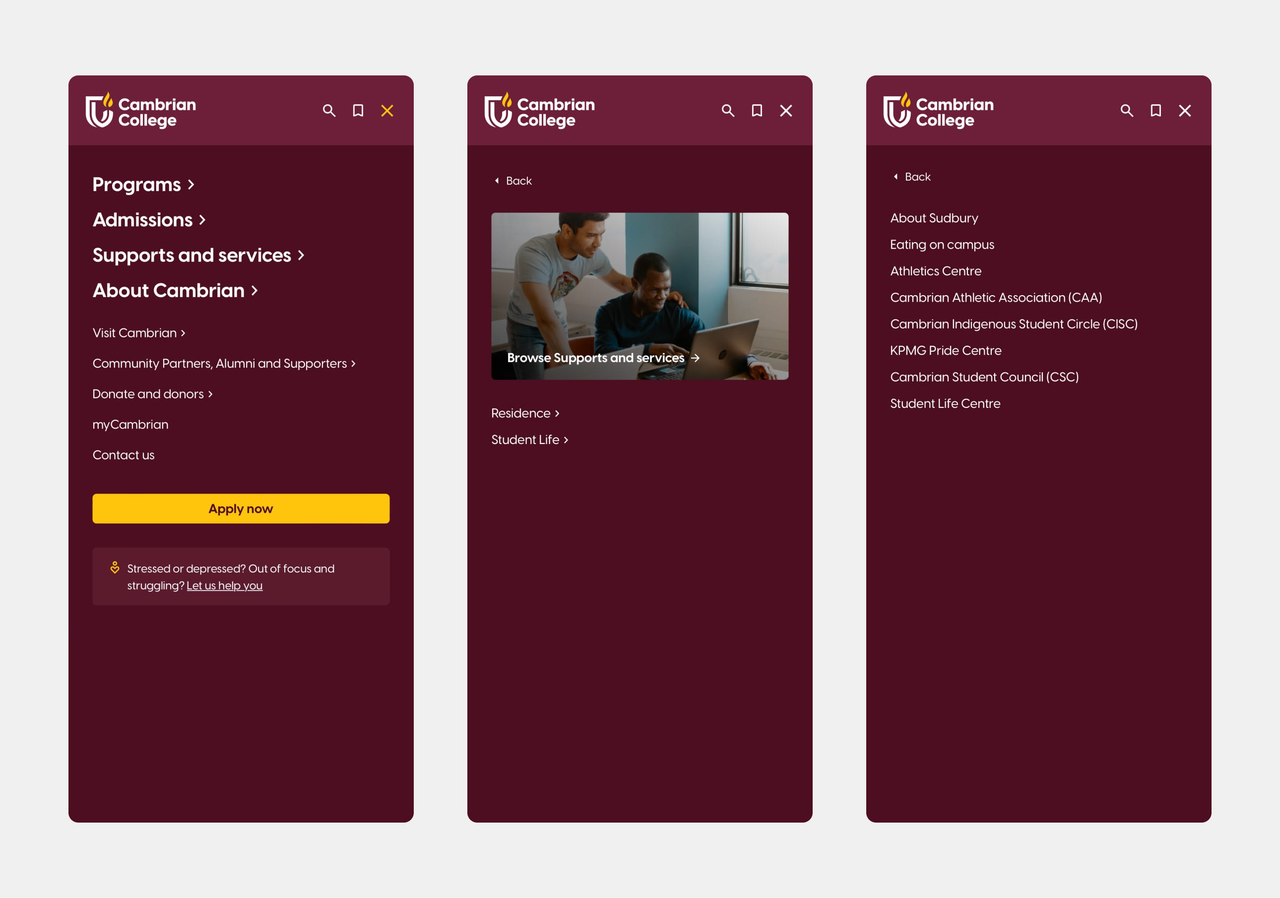
One of the major challenges of the project was to distill a complex content architecture into a simplified and intuitive navigation experience. Our approach was to conceptualize a stepped navigation system that prioritizes the most frequently used sections of the website, deferring secondary and tertiary sections to guide users smoothly towards their final destination. This clutter-free solution offers more space for content than traditional menus and ensures users aren't overwhelmed with too much information. Our research highlighted the importance of providing a consistent experience across both mobile and desktop platforms, which this approach successfully achieves.
An in-page navigation system to quickly get users to the information they want
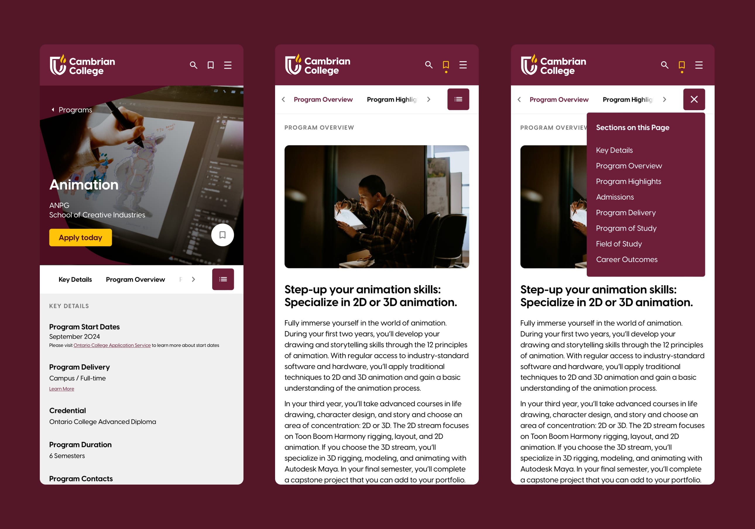
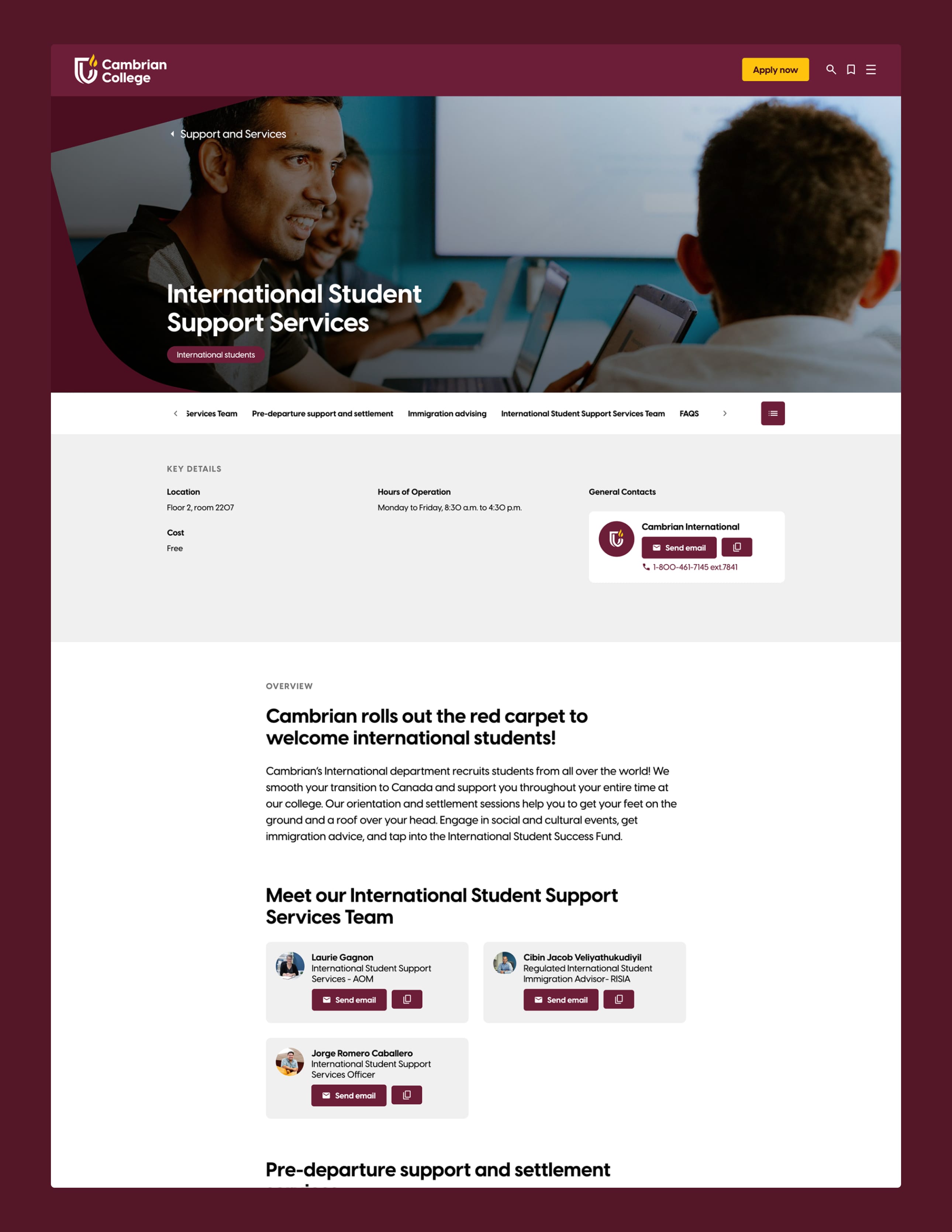
We designed an in-page navigation system that guides users seamlessly through page content, ensuring easy orientation on mobile, tablet, and desktop devices. This menu provides an overview of all sections, allowing users to quickly find what's important to them. It also serves as a wayfinding tool, following the user down the page and highlighting the current section to indicate their position. Users can scroll through the menu by clicking, dragging, or scrolling sideways. Additionally, there's a button to view all sections at once.
Search and refine
Focus group participants emphasized the importance of customizable program searches, enabling them to evaluate programs based on individual criteria such as area of interest, credentials, program delivery, start date and programs for international students. This approach enhances access to more relevant information based on each user's preferences. It was noted that while some prospective students have clear preferences, others require more guidance in finding suitable programs. The search & refine component accommodates both types of users, effectively highlighting the diverse offerings available to Cambrian students.
The peekaboo
Our early exploration of content architecture revealed the importance of making all programs easily accessible. We aimed to guide users deeper into the site while providing validation points along their journey. To achieve this, we designed a "peekaboo" component that allows users to view key program information before diving deeper. This intermediary step allows users validate their choice without delving into a detailed program page only to find it unsuitable.
Additionally, we sought a creative solution for managing content-heavy sections. By using the peekaboo feature, we could de-emphasize less critical content to keep pages concise while still offering users the option to see more.
Saved Programs
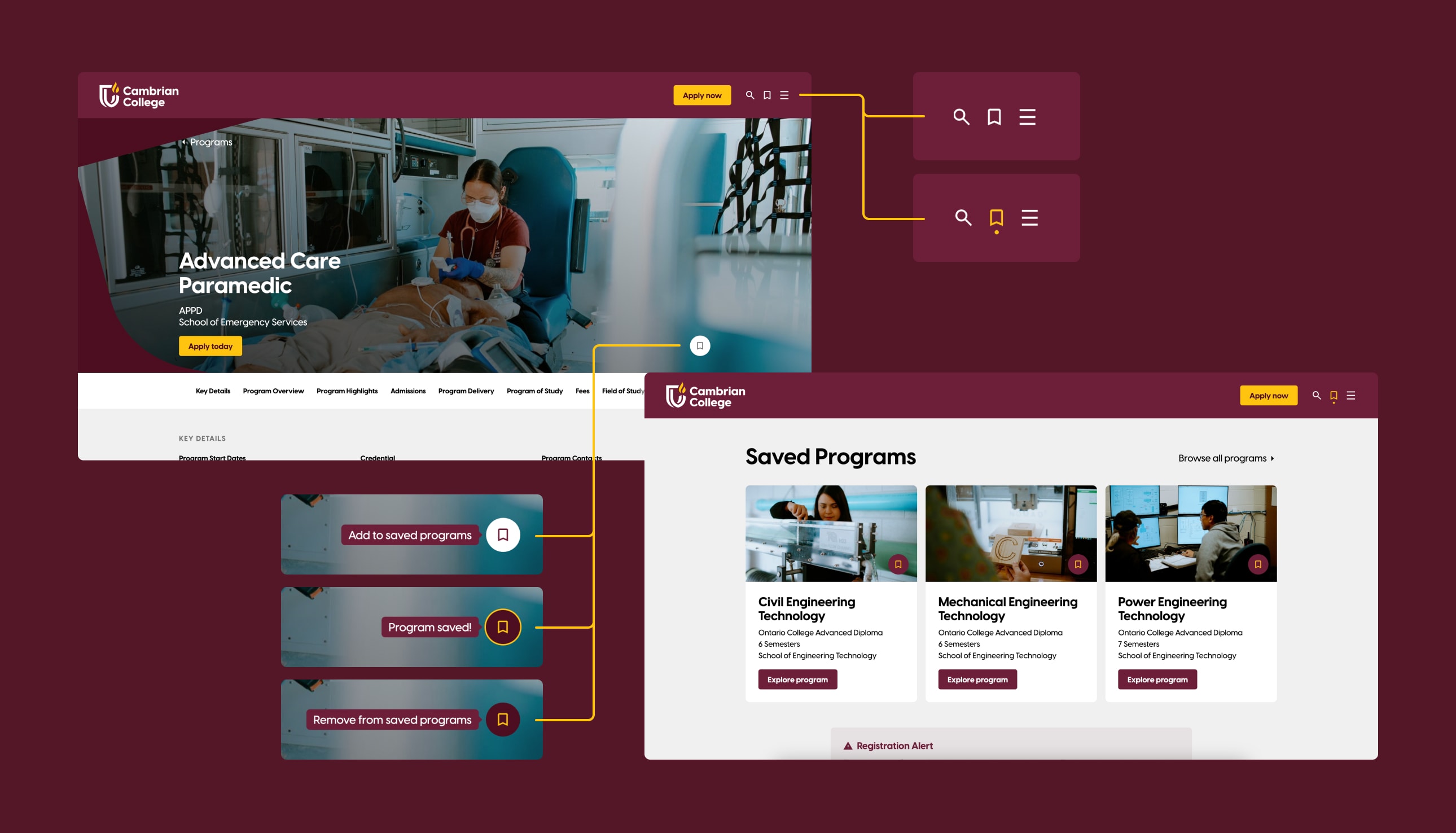
We focused extensively on enhancing convenience for prospective students. Acknowledging that students often compare offerings from various post-secondary institutions, we aimed to make it easy for them to quickly identify and save programs of interest for future reference. This new feature uses cookies to store their selected programs on their computer, eliminating the need for a user account. This functionality has been well-received by students.
New Brand
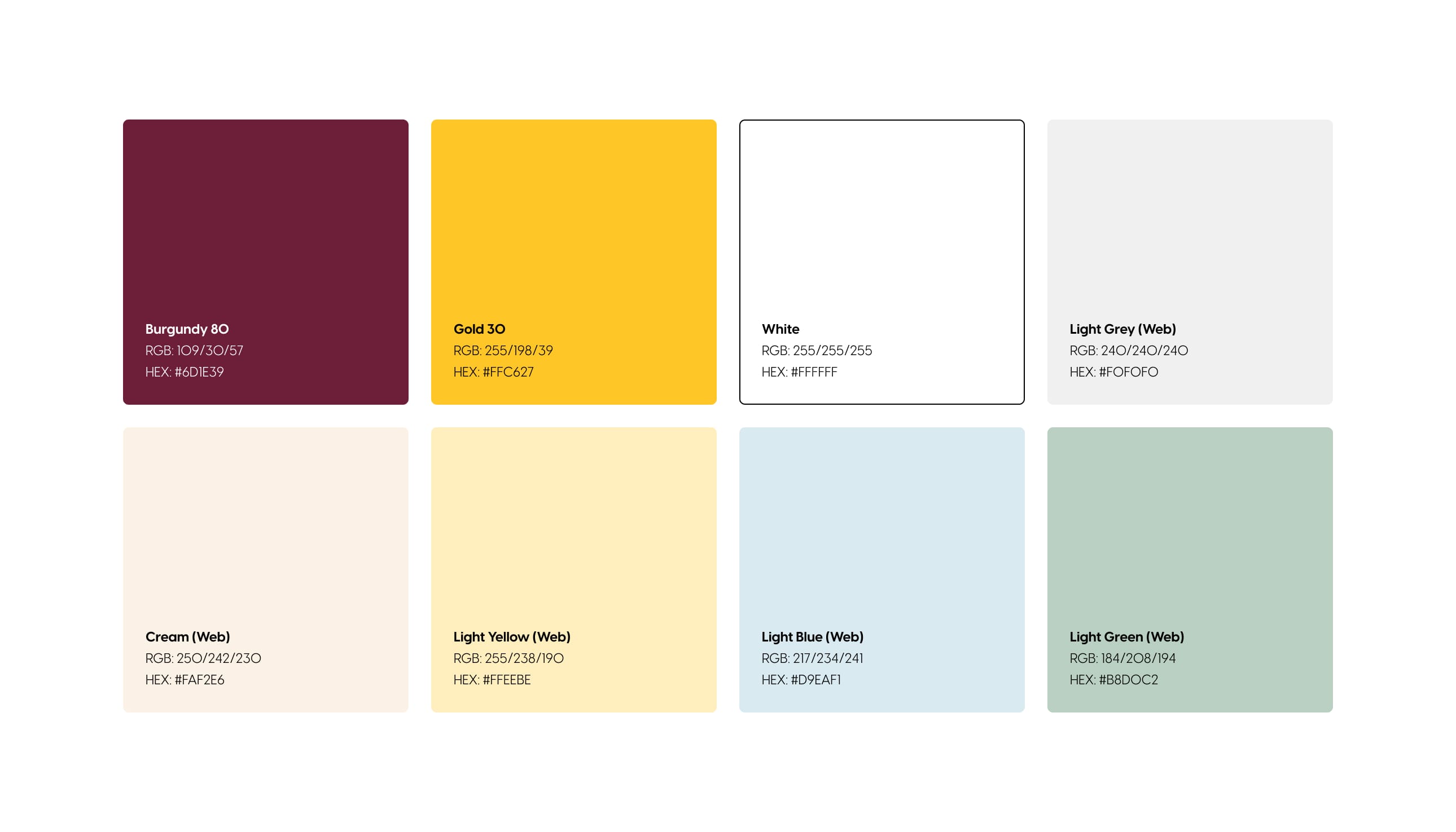
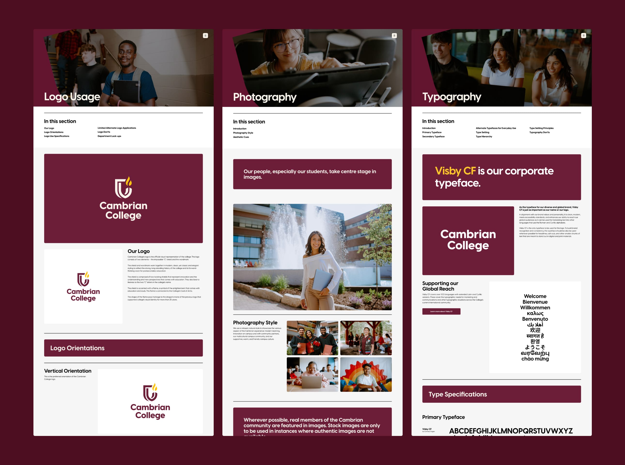
During the development of the new website, the College embarked on a rebranding process to refresh its image and align with its new and exciting vision for the future. We collaborated closely with their marketing team, offering guidance and constructive feedback on the new brand. To enhance this new brand, we designed a graphic element that could be consistently applied across the website, social media, and printed materials. This tilted, framed picture-window, inspired by the shield from the new brand, creates visual focus and serves as a compelling and creative way to showcase photography and video. The tilted shield has become a distinctive brand feature that immediately conveys the identity of Cambrian College.
Development
Our development team proposed various strategies to leverage technology, aiming to maximize the versatility and power of the new Cambrian College website. Here are a few expertly executed implementations that significantly contributed the website's success:
Headless WordPress
Cambrian College already had a strong foundation in WordPress, so instead of wiping the slate clean, we chose to leverage their established institutional knowledge. There's significant value in building upon what already works. One notable update in the latest iteration of the site is the adoption of WordPress in a "Headless" architecture. This approach separates the content management capabilities of WordPress from the website's front-end, providing our development team with enhanced flexibility. It accelerates both development and updates, while transforming WordPress into a centralized content hub usable across multiple platforms, not just the website. This configuration enhances site speed, flexibility, and future adaptability, ensuring Cambrian College's website evolves alongside its education offerings.
Data Bridge API Integration
We created a custom integration known as the "Data Bridge." Its primary function is to synchronize data between Cambrian's internal API, which stores critical program information like registration details, dates, and course costs, and our Headless WordPress instance. This synchronization occurs automatically on a scheduled basis, ensuring that the website always displays current information without requiring manual updates from editors. This efficiency frees up editors to concentrate on other website enhancements. Since implementing Data Bridge and updating the website, traffic has surged by 330%, underscoring the impact of accurate information placement on user engagement.
Cutting Edge
Staying current with technology isn't just a trend—it's essential in higher education. That's why, when tasked with redesigning Cambrian College's website, we went all-in on the latest tech. Our approach involved building the site using React with Next.js, and integrating tools like Radix UI and Tailwind CSS. Hosting it all on Vercel, a cutting-edge serverless platform, ensures blazing-fast load times, seamless scalability during peak admissions periods, and meets the high digital standards expected by today’s students and faculty. In a world where education is constantly evolving, we’ve set Cambrian College up with a digital presence that's ready for anything.
Results
The results were immediately noticeable from launch, with the project yielding significant positive outcomes.
- 330% increase in website traffic.
- 125% increase in page views.
- 41% improvement in mobile web performance.
- 99% performance score on desktop.
- 23% overall improvement in PageSpeed Insights performance.
- 35% improvement in SEO score.
- 18% improvement in accessibility score.
- The new "saved programs" feature was particularly well-received, enhancing convenience for prospective students.
Lessons Learned
Throughout the project, we learned the importance of:
- User-Centered Design: Focusing on user needs and feedback significantly improves engagement and satisfaction.
- Flexible Technology Choices: Using modern, flexible technologies drastically enhances website performance and adaptability.
- Aiming high: As the saying goes “Shoot for the moon. Even if you miss, you'll land among the stars.” Researching global benchmarks across multiple industries helped us discover innovative and effective methods for managing and presenting content. By looking beyond immediate competitors and regional practices, we were inspired to adopt new approaches and forge a unique path forward.
- Inspired people: Achieving a great outcome requires true collaboration. It demands honesty and transparency to analyze processes thoroughly, along with a willingness to embrace new ideas and methods. Cambrian College's team embarked on this journey with open minds and enthusiasm. They were eager to create and implement the new systems we developed together. Their developers were always ready to collaborate with our team, while their management team was committed to making tough decisions and coordinating input from numerous internal stakeholders, gathering content, and keeping senior leadership informed. Most importantly, they were a pleasure to work with. Inspired people fuel inspired projects.
Conclusion
The Cambrian College website redevelopment project successfully addressed the institution’s challenges, resulting in a significant increase in traffic and user engagement. Our branding implementations and technological solutions not only improved the website’s functionality but also reinforced Cambrian College’s vibrant and welcoming image.