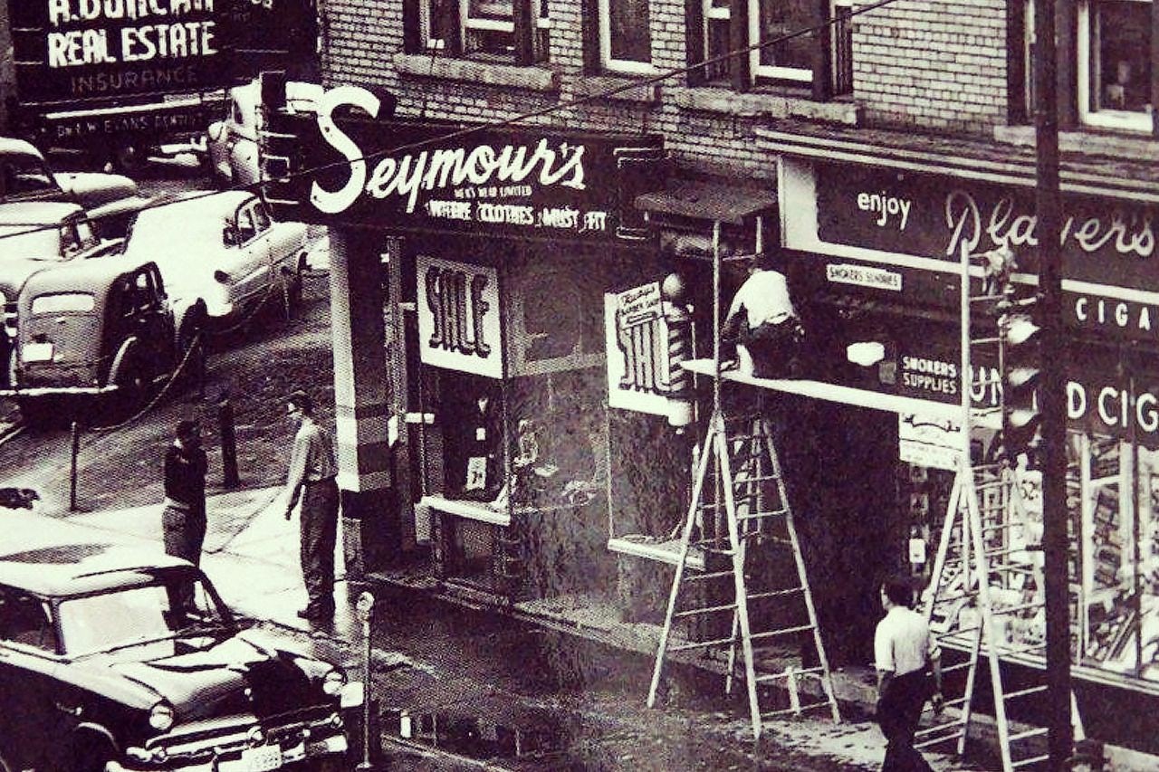
As designers of the 21st century, we have the luxury of choosing from an endless catalog of digital typefaces to find just the right one for the job. Font styles, kerning and leading are all easily modifiable by a quick click of the mouse. There once was a time where hand-painted, hand-lettered signs were common place.
Back then, the production and layout of a sign required someone who knew typography intimately. It demanded love. It was an art that required the work of a professional with tons of experience. As technology continues to evolve and printing production becomes cheaper and cheaper hand-painted signs, in Sudbury anyway, have gone the way of the dinosaur. If you look long and hard, however, there are still a few up around town. Here are our favourites (good and bad) from past and present:
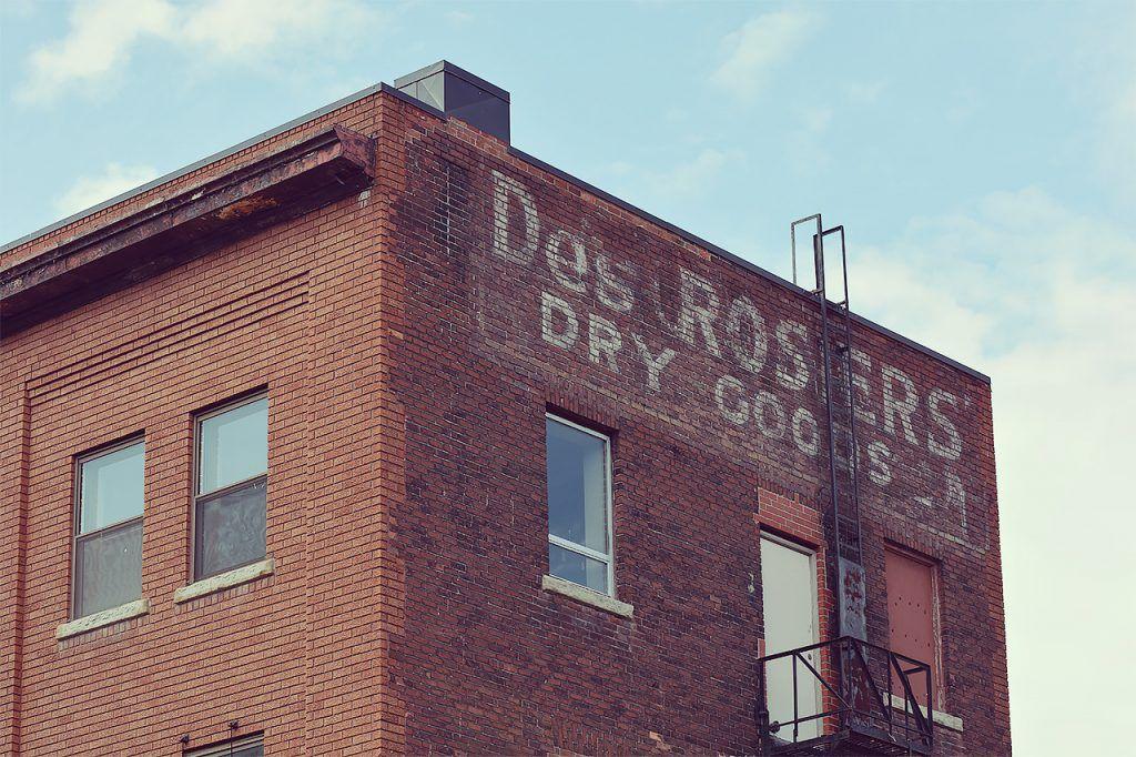
This hand-painted classic for Des Rosiers’ Dry Goods acts as an homage to days gone by.
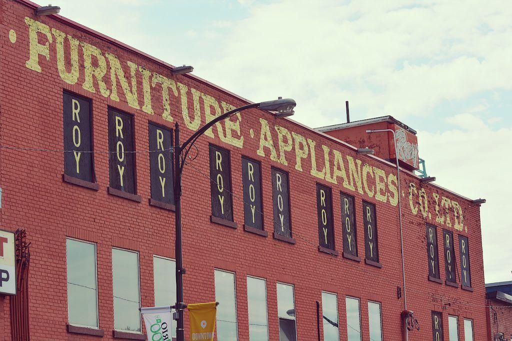
Roy’s Furniture on Durham might have closed last year but their presence is infinitely stamped on their former strip. Here’s to hoping the new owners keep it up!
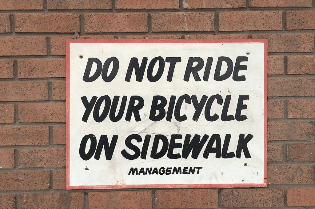
This was a nice catch. The management of the Gloria’s Restaurant building does not want you to ride your bicycle on the sidewalk.
Caught this one in Capreol. Kerning is a little loose but it’s the character that matters!
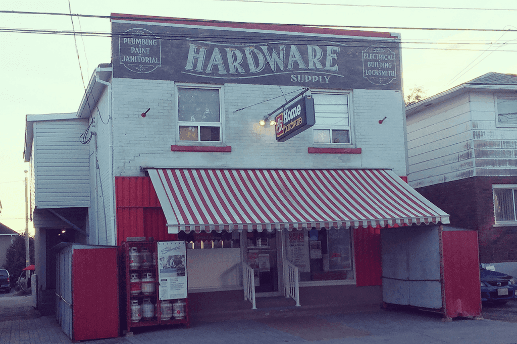
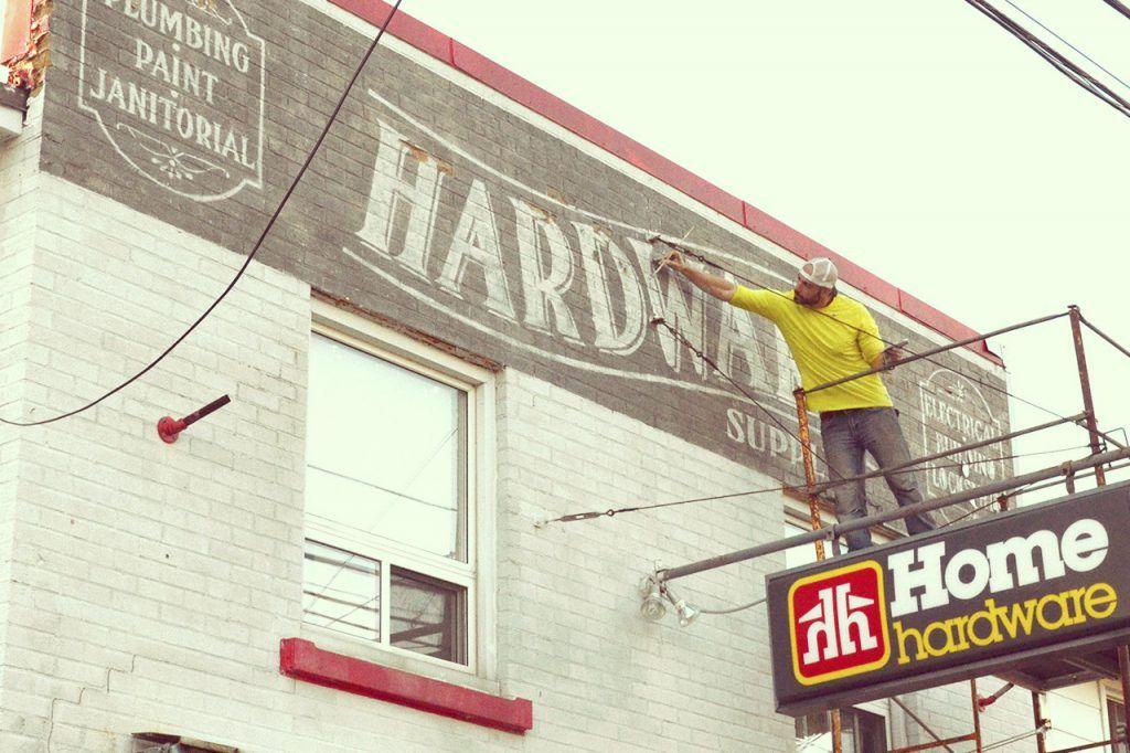
Skakoon Home Hardware’s location was being used as a movie set and a beautiful mural was added to the face of the building for the shoot. Turns out the owner liked it so much he asked for it to remain.
This sign is a little more macabre as it is used for way finding at Jackson & Barnard funeral home.
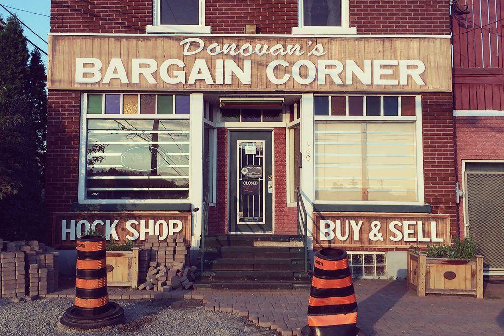
Who knew the Donovan was home to so many cool hand painted signs?
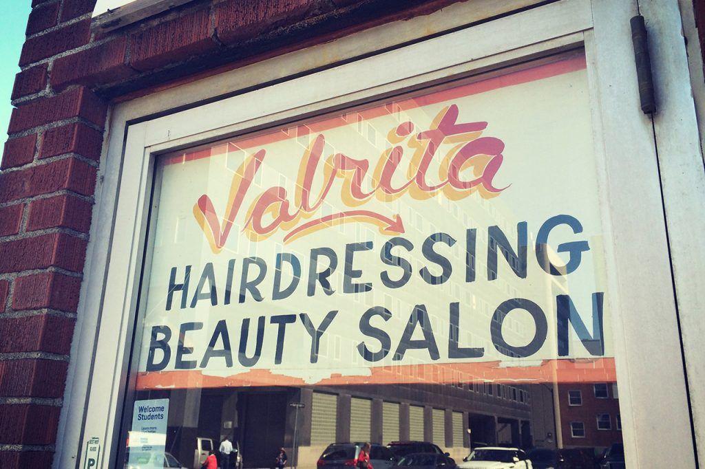
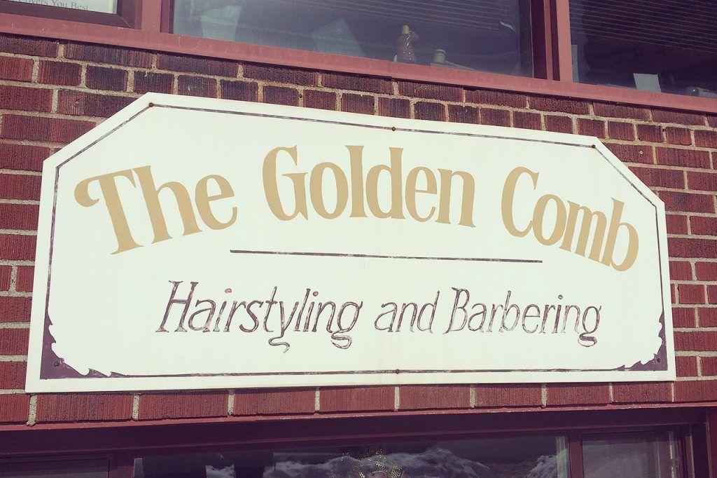
This combination of unique script type with a more traditional sans-serif makes us smile.
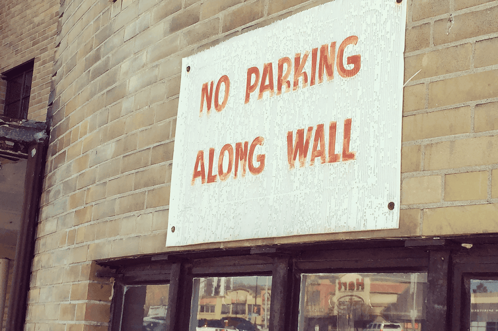
This sign acts an oppressive reminder to not park along the wall. The fading of the letters exposes the stroke work of the artist.
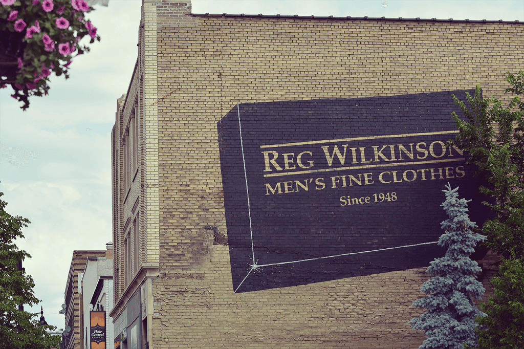
How could you we ever forget this massive clothing box on Durham? Thanks, Reg!
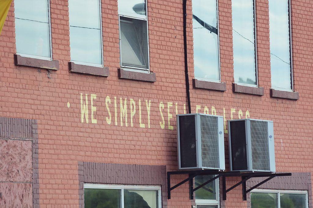
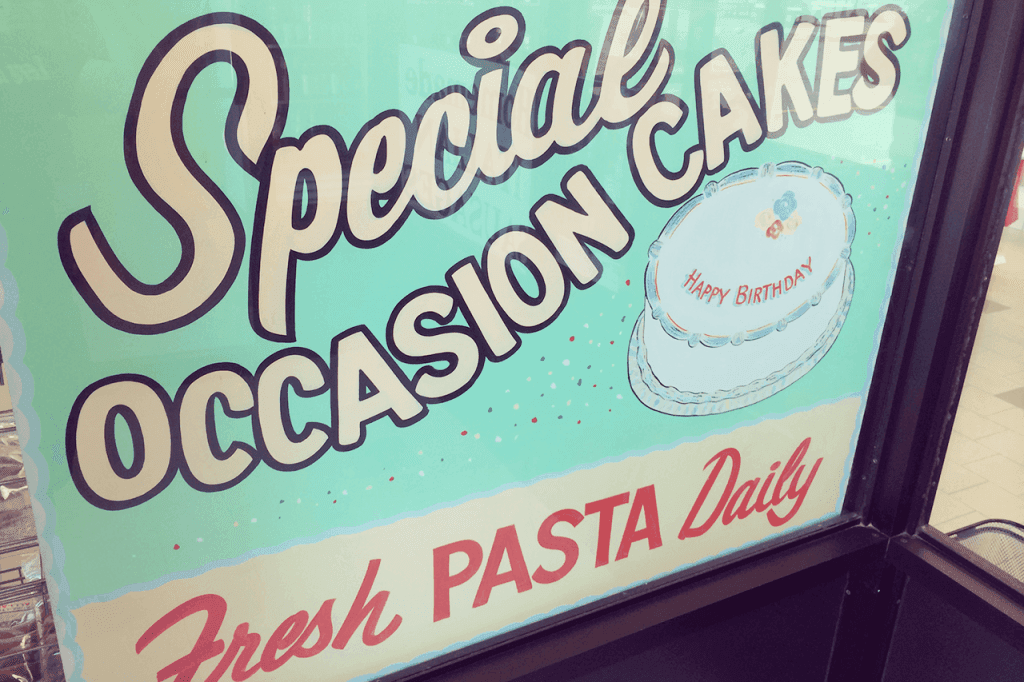
This artist got a little more ambitious by painting in serif letters.
Regency Bakery has this one more or less hidden but it remains to be one of our favourites—it has aged well and displays a nice combination of Futura-esque headline type with a more custom hand-scripted type.
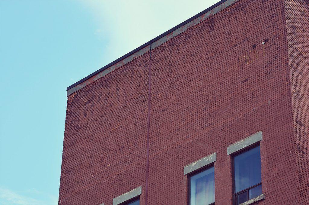
Keep it moving, nothing to see here. Or wait, is there? This phantom lettering from a foregone era still remains on the face of the Grand Theatre if you look hard enough.
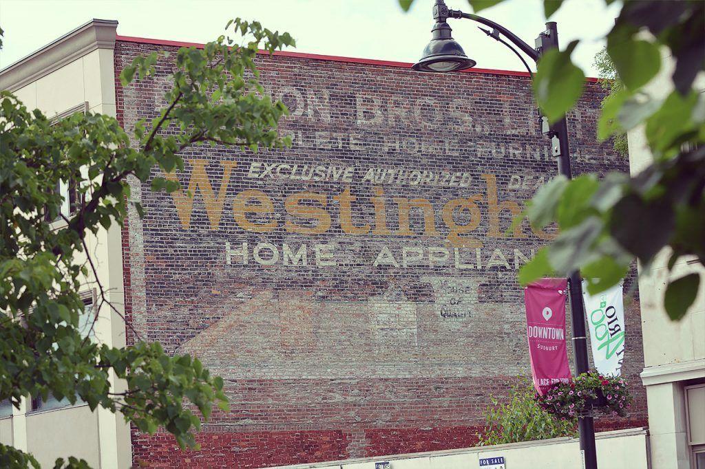
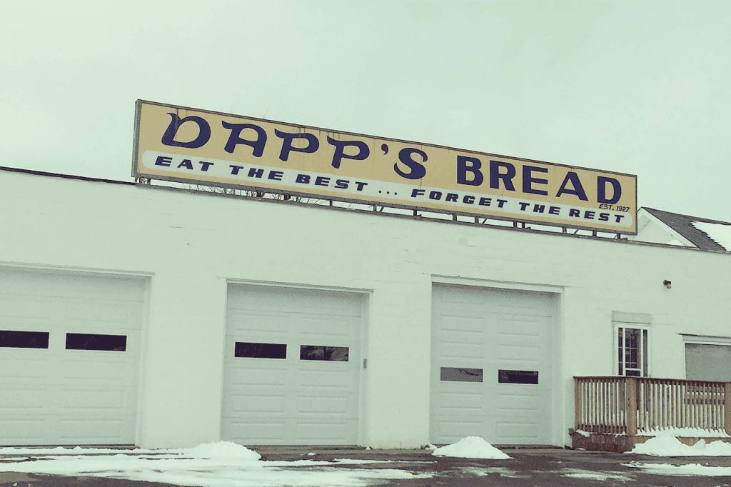
We kept our absolute favourite for last. This longstanding mural has withstood decades upon decades of wintery punishment and still holds that vintage-y charm that we’ve grown to love. Here’s to a couple more decades!
A couple of years ago, some sign lovers from the US made this beautiful documentary on the dying art of sign painting. If you like this blog post, you’ll love this film.
Special shout out to Bruno Rocca, our favourite local sign painter, pictured above, who painted the lockers in our studio as well as those slick “You Are Beautiful” letters on Durham Street, and to all the other sign painters out there, we salute you! We hope the next generation of sign painters are in their basements practicing their strokes with hands filthy of 1-Shot paint and solvents. Did we miss a fantastic sign? Know some of the histories of the signs we posted? Send us a message!