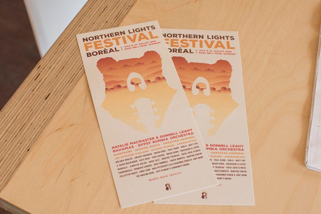
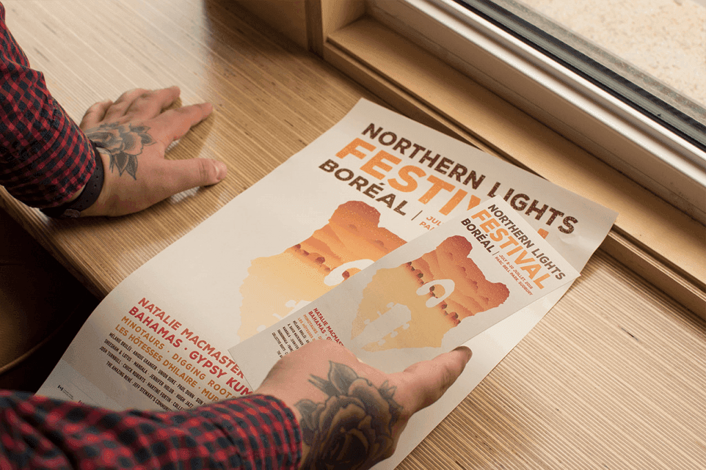
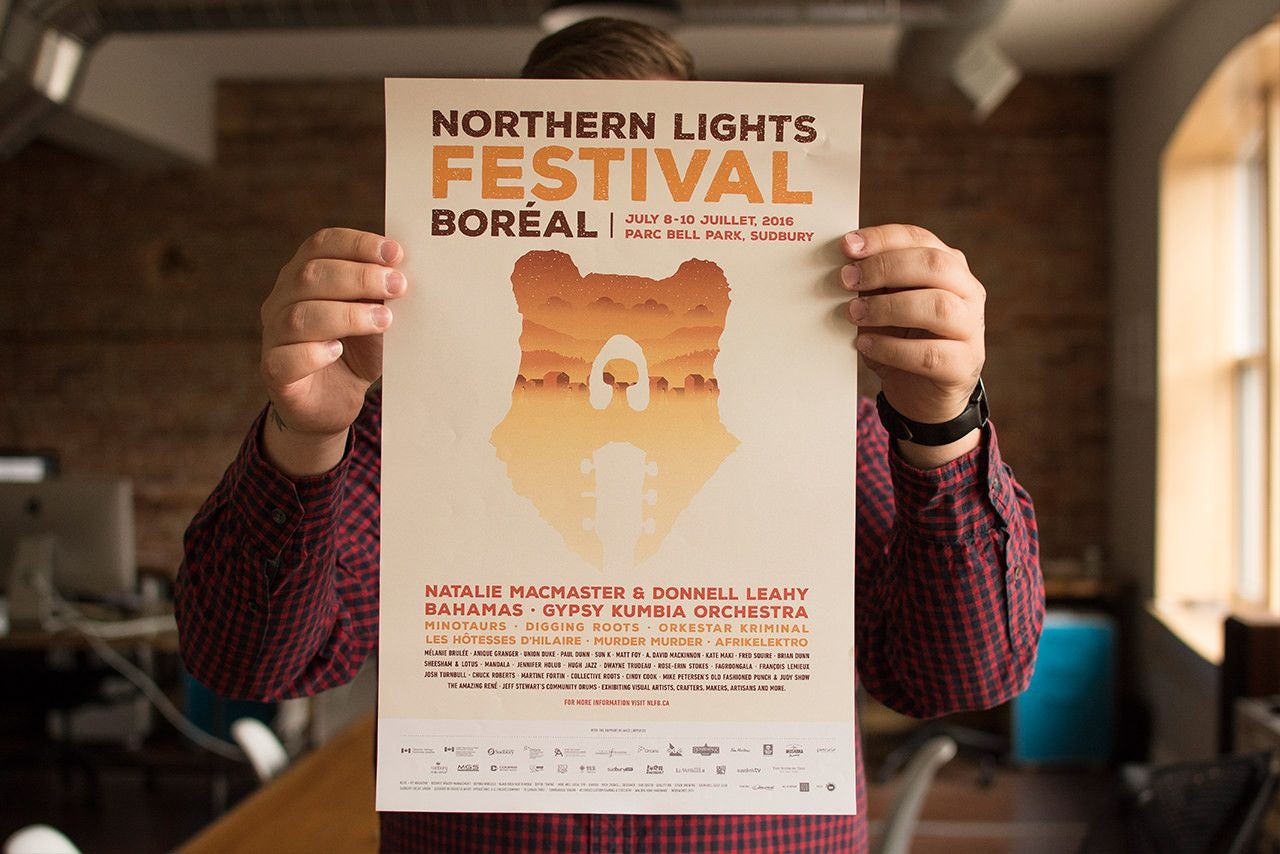
The Northern Lights Festival Boréal (NLFB) is among Canada’s longest running outdoor music festivals: they are holding their 45th edition in July. First held in 1972, the festival is known for presenting Canadian roots and modern music from emerging and highly acclaimed artists. The NLFB organizers were looking for a more youthful and vibrant brand for this year’s festival and came to us to help make it happen. Here’s a look at the design process behind the branding.
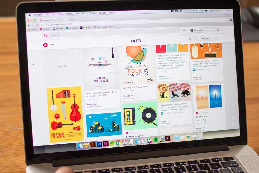
Beginning with a mood board to generate a shared creative direction for the project, our team brainstormed several ideas that would encompass the festival’s new look and feel. We wanted to stay away from designs that were similar to previous years. This involved coming up with ideas that didn’t have overt musical illustrations and instead encompassed the essence of the NLFB. Nature became a theme we could all agree was intrinsic to the festival.
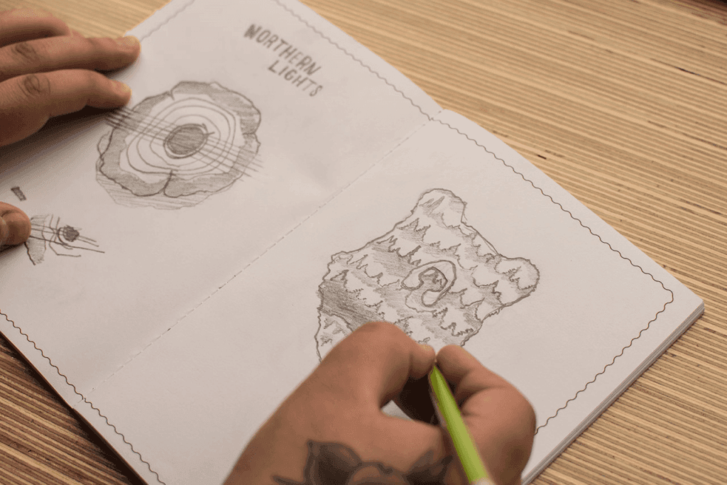
The bear was chosen as the central image for the branding because of its symbolism of happiness and fun. The NLFB permeates energy in Northern Ontario’s artistic community, and the iconic image of the bear evokes the youthfulness and vibrancy of the festival. Our initial iterations of the concept had very detailed imagery, involving a bear placed in a scene. After playing around with negative space, the bear became the scene, making for a much cleaner execution of the idea.
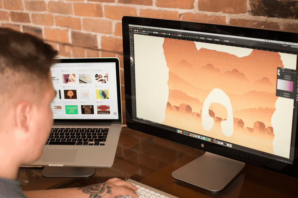
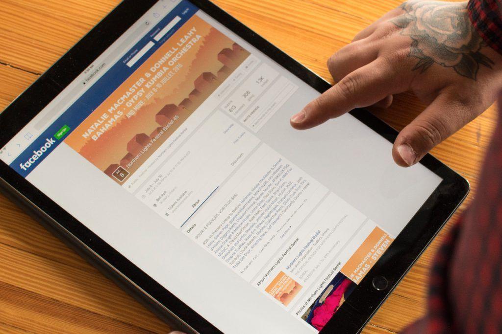
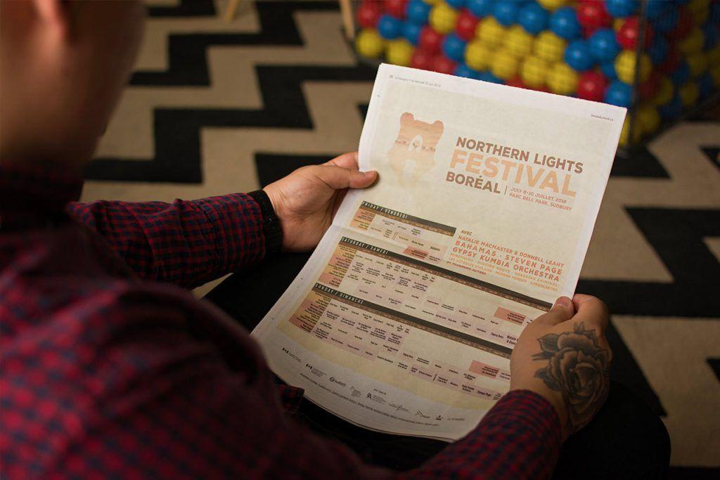
The challenge was targeting a new demographic while also remaining faithful to the brand image that core audiences knew and loved – our team was able to create a brand that appealed to both. The fun-loving bear embodies the unique fusion of both urbanity and wilderness. We produced digital billboards, imprints, web banners, apparel, artist lanyards and signage to captivate attention and promote excitement for this year’s festival. The 45th edition of the Northern Lights Festival Boréal promises to be unforgettable; see you down at the fest!
